The iTunes App Store and Google Play now offer more than 600,000 apps each. And Apple’s most recent earnings call revealed that the company has paid out more than $5.5 billion to developers since the launch of the App Store. With unprecedented consumer adoption of iOS and Android devices, low barriers to entry for developers and throngs of paying customers, Apple and Google have created massive economic opportunities for developers.
In particular, iOS and Android have made it possible for independent developers and mobile app start-ups to thrive. As industries mature, however, we expect established players and brands to invade from other platforms, depressing opportunities for many early entrants. Along with this, we expect to see market revenue concentrate among fewer larger players. For this report, with these typical patterns in mind, Flurry modeled worldwide mobile app revenue, revenue sources and revenue concentration among top-ranked mobile apps on iOS and Android. For this report, we used data from over 200,000 mobile applications in the Flurry Analytics data set. Let’s start with market growth.
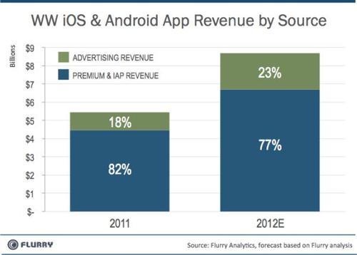
The chart above compares worldwide revenue generated by iOS and Android apps in 2011 vs. 2012. For 2012, we modeled the first half of the year based on actual data, and then applied growth rates to estimate the rest of the year based on the proportion of revenue observed in 2011 between the first and second half of that year. In 2011, Flurry calculates that iOS and Android applications generated a total of $5.4 billion across premium, in-app purchase and advertising revenue. Advertising made up 18% of the revenue. In 2012, Flurry forecasts that revenue will grow by 60% over the previous year, reaching $8.7 billion. Advertising is the fastest growing revenue category with growth forecasted at more than 100%, from $980 million in 2011 to $2 billion in 2012, delivering 23% of 2012 total revenue. Likewise, premium and in-app purchase revenue is also increasing at a rate of 50%, from $4.5 billion in 2011 to $6.7 billion in 2012.

Next, we look at the concentration of revenue among top ranked apps from 2010 to 2012. Please note that for this analysis, we focus on premium and in-app revenue only, excluding ad revenue. Comparing these two years shows how dramatically the distribution of revenue is shifting across the long tail. Starting on the left, in 2010, the green part of the column shows that 28% of revenue was generated by the Top 25 ranked titles on iOS and Android. In 2012, we estimate that the Top 25 will drop to commanding about half of total revenue, or 15%. Likewise, comparing the grey sections of each column, the rest of the Top 100 apps will drop from earning 27% of revenue in 2010 to 17% of revenue in 2012. Conversely, revenue generated by the long tail significantly grows from 2010 to 2012. Comparing the blue sections, any apps ranked beyond the top 100, we observe that long tail revenue explodes from earning under half of all premium and in-app purchase revenue in 2010 to over two-thirds in 2012.
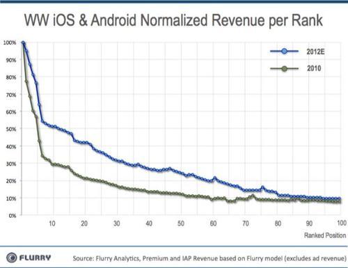
Finally, we rank the revenue generated by each of the top 100 positions across the iTunes App Store and Google Play. For each year, we set the revenue generated by the top spot at 100%. Then, relative to the top spot, we take the percent each position generates from the 2nd rank all the way through the 100th. By normalizing each curve in this way, we can compare the relative revenue generated per ranked position in the top 100 per year. For example, we can see whether ranking number 50 generates more relative revenue in 2012 versus 2010. Most interestingly, this kind of analysis shows whether the developer “middle class” is better off today than its “parents’” generation.
Now that we have relative earning power mapped per ranked position, we can study the heights and shapes of the curves. Comparing 2010, the green curve, to 2012, the blue curve, we notice that two things are happening simultaneously. First, each position in the top 100 is more valuable now, which makes sense because the market has grown overall. Second, the blue 2012 curve is flatter. Unlike the green 2010 curve, which steeply drops during the top 10 ranked positions, indicating the wealth is more concentrated at the top, the blue 2012 curve stabilizes shortly after the top 5 positions and then maintains a high, gently sloping plateau all the way through the 80thposition, where it then settles just above the green curve, ostensibly continuing to “fly” at an altitude higher than that of the green curve out across the long tail. In short, this means that the middle class has more earning power, taking a substantial share of total wealth in the economy.
With the app economy booming, companies like Facebook, Twitter and Zynga are under tremendous pressure from investors to seize the opportunity presented by this new platform. However, with software delivered in the form of downloadable applications, unguaranteed network connectivity, different consumer behavior and control exerted by platform providers such as Apple and Google, the mobile app landscape creates different, meaningful challenges for companies attempting to enter the app space from other platforms. Combined with a marketplace that reduces the power of brand recognition (e.g., apps are free for consumers to try risk free), market wealth unexpectedly continues to shift to the long tail, funding continued R&D, advertising budgets and other activities that increase their competitive strength. The age of middle-class app developer has arrived. In this economy not only are the rich getting richer, but so too are the poor, and gaining on the rich.