Apple and Samsung together account for more than half of the world’s active smartphone install base, and are clearly the leaders of the OEM smartphone market. But if we take a closer look at how they each earn their market share, there are remarkable differences. This Flurry report takes a closer look at Apple versus Samsung market share, the number of products each company has in the market, top devices in the top 20 countries, and more.
Flurry Analytics, owned by Verizon Media, is used in over 1 million mobile applications that reach 2 billion smartphones per month. Unlike other market share analyses that rely on device shipments or sales, we measure devices currently active in the market, which we believe presents a more accurate picture of current market share. Let’s begin with an August 2020 snapshot of active devices by OEM.
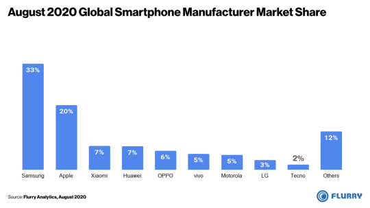
In the chart above, we list device manufacturers by their share of global active devices. Note that due to insufficient data in China and Europe, we exclude those regions from our analysis. Starting on the left hand side, Samsung is the global leader with 33% of the world’s active smartphones, followed by Apple with 20%. Now let’s take a closer look at which devices are most popular.
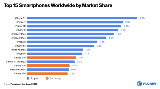
In the chart above, we list the world’s top 15 active smartphones using data from August 2020. We color coded Apple devices in blue and Samsung devices in orange. You’ll note that all of the top 15 devices are made by Apple or Samsung, with Apple holding the top 10 spots. Expanding to the top 15, Samsung Galaxy devices begin to show up. Of the top 15, Apple has 12 devices, and Samsung 3. No other manufacturer’s device appeared on this list, reminding us how much these two OEMs control the world’s device base.
Considering the first two charts together, you’ll likely wonder how Samsung leads Apple in global market share by so much while holding very few of the top 15 devices. That could come down to how they approach product lines. Most years, Apple launches one or two iPhone models, sometimes with a few different device tiers as was the case with the iPhone 11 series. Samsung, on the other hand, launches as many as twenty different models in a given year to accommodate regional preferences and provide coverage across the price spectrum. To illustrate this, let’s do a side-by-side comparison of the market share versus the number of active devices between Apple iPhone and Samsung Galaxy lines.
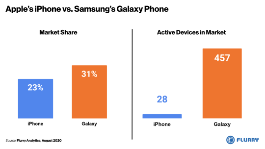
On the left side of the chart above, we compare the market share of Apple’s iPhone line, in blue, to that of Samsung’s Galaxy line, in orange. And on the right side, we compare the number of active devices between the two product lines. The Samsung Galaxy line is 8 percentage points higher but achieves this market share with 457 devices compared to Apple iPhone’s 28 devices. Slowing down for a moment, this means that there are 16X more unique Galaxy models active around the world compared to Apple iPhone models. This fragmentation of Samsung devices helps explain how Samsung can have more total market share without having any of the top 10 active devices. With this approach, the Samsung Galaxy active user base is 1.4X that of Apple’s iPhone. While this translates to more market share, Samsung’s fragmentation could also raise questions about economies of scale and complexity in manufacturing, distribution and promotion.
Overall, the top 15 devices shown in our earlier chart represent 20% of the world’s smartphone market. The remaining 80% of the market comes from more than 8,000 device models offered by over 800 OEMs, illustrating how fragmented the entire industry is, Apple notwithstanding. Let’s next check out which devices are most popular in each country.
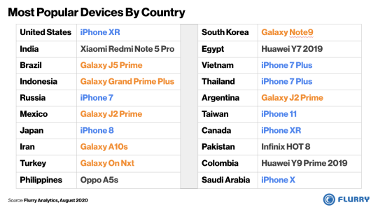
In the table above, we list the most popular device in each of the top 20 countries, excluding Europe and China due to insufficient data. Doing so reveals more OEMs and devices, with some regional trends appearing. In Latin America, including Brazil, Mexico and Argentina, Samsung’s Galaxy J line is the leader. In countries with higher income per capita, such as the United States, Canada and Japan, the iPhone takes the top spot. Notable Chinese manufacturers Huawei, Oppo and Xiaomi also appear on the list in parts of the Middle East, Asia and Latin America. And third party analyst reports show that both Huawei and Xiaomi have strong penetration in China.
Samsung’s approach of shipping many more device variants, and at lower price points, has resulted in capturing a third of the world’s smartphone install base. Apple, with fewer devices at higher price-points controls a one-fifth of the world’s install base. And while Samsung has a larger total footprint, Apple may enjoy economies of scale with longer production runs across fewer SKUs and more focused distribution in the world’s more developed economies. Either way, this competition leads to innovation and choice for consumers, further driving advances in smartphone technology and capabilities. Make sure you subscribe to the Flurry blog and follow us on Twitter and LinkedIn to stay up-to-date on the latest smartphone adoption and usage trends.
iPhone is a trademark of Apple Inc., registered in the U.S. and other countries.
Samsung and Samsung Galaxy are trademarks of Samsung Electronics Co., Ltd. in the United States or other countries.
The Flurry blog (https://www.flurry.com/blog/) is an independent blog and has not been authorized, sponsored, or otherwise approved by Apple Inc. or Samsung.