Just as a company might look to metrics such as their Net Promoter Score or individuals might look to their Klout Score to judge their social media influence, app developers want benchmarks to evaluate how their apps are doing relative to other apps.
To provide benchmarks, we studied apps by their retention and size of user base. We also compared these two dimensions to see how they relate to one another. For example, do apps with more users have stronger retention than those with fewer users due to network effects? Do apps with smaller audiences see higher retention because they focus more on the interests of a particular segment?
We started our investigation by identifying the apps that Flurry tracks that had at least 1,000 active users at the start of November 2012. That eliminated apps that were being tested or were no longer being supported. We then split apps into three equal-sized groups based on their total number of active users. To be in the top third of apps, an app needed to have 32,000 active users. To be in the top two-thirds, it needed to have 8,000.
We followed a similar process to categorize apps based on retention. For this analysis, retention was defined as the percent of people who first used an app during November 2012, who also used it again at least once more than 30 days after their first use. To be in the top third for retention, an app needed to have at least 37% of those who started using the app in November do so again more than 30 days later. To be in the top two-thirds, 22% of new users in November needed to use the app again more than 30 days later.
Having classified apps into three groups based on both active users and retention, we then compared how the two metrics relate to one another. The proportion of apps that fall into each of the nine categories that result from considering retention and active users jointly is shown in the table below. If active users and rolling retention were completely independent, then approximately 11% of apps would be in each of the nine categories. As shown in the table, the mid level categories for each metric follow that general pattern, but the categories in the corners of the table don’t. The differences between what the distribution across the nine categories is, and what it would be if the two dimensions were completely independent, is statistically significant.
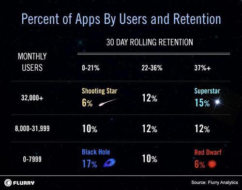
Fifteen percent of apps are in the enviable position of being the top third for active users and also in the top third for rolling retention. We refer to those as Superstar apps since they perform well on both dimensions. These apps are best positioned to generate revenue regardless of their monetization model. Another 17% of apps are at the opposite extreme: they are in the bottom third for both user numbers and retention. We refer to that category as a Black Hole. Apps in this “cell” could be relatively new apps that are still trying to establish a user base, old declining apps or apps that are of poor quality.
Possibly the most interesting apps are in the bottom right and top left corners of the table. We refer to the 6% of apps in the bottom right category as Red Dwarfs because they have a relatively small user base yet are doing well on retention. Those are likely to be successful long tail apps. In the opposite corner from that are 6% of apps we refer to as Shooting Stars since they have a lot of users, but may fade away quickly due to poor retention.
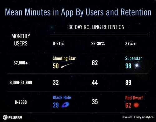
Unsurprisingly, the average number of minutes per month users spend in high retention apps is greater than in low retention apps. This can be seen going from left to right in each row of the table. For example, Superstar apps have almost twice the average number of minutes per user than Shooting Star apps, 98 minutes versus 50 minutes. This correlation between average time per user and retention is statistically significant.
Average time per user per month is also positively correlated with the number of active users. This can be seen by looking from the bottom to the top of each column in the table. For example, users spend more than 50% more time in Superstar apps than in Red Dwarfs. Once again, this correlation is statistically significant; however the correlation between time per user and retention is stronger than that between time per user and active users.
These results imply that developers need to make retention their top focus. Developers can impact retention by shaping and modifying the app experience. It’s within their control. Furthermore, the association between retention and time spent implies that retention drives revenue. More repeat usage means more opportunities to generate revenue from in-app purchase and advertising. Finally, the more useful and compelling an app, the better it retains users, making acquisition efforts more efficient. Acquiring aggressively before an app retains well can be a costly mistake. On the flip side, an app that retains well can generate powerful word of mouth, which is the ultimate (and free) promotional machine. The more a developer masters retention, the better their chances of turning their Red Dwarfs into Superstars.