Flurry’s engineers work with multiple, large scale custom systems. In an effort to further give back to the engineering and app development communities, we will periodically publish posts that cover more technical issues. Ali Mehrpour, one of our lead Android SDK developers, wanted to share some of his findings in rebuilding Flurry’s mobile app using the latest developments in Android technology.
Flurry Analytics has been at the forefront of the mobile app industry since launching the world’s first analytics platform for iOS and Android apps in 2008. Since then, we’ve supported app developers worldwide in growing their businesses by improving user acquisition efforts and boosting engagement and retention strategies.
Flurry’s Mobile App
Flurry’s mobile app (for Android and iOS) streamlines analytics on the go, wherever you are. The app lets you monitor your app’s key events, real-time metrics, and activity as well as get a push notification if your app’s metrics spike or dip beyond a custom threshold or detects an issue (exception, crash, error).
The first version of the app was published in 2015 and received positive attention, but slowly the number of users began to decline as they started complaining about the app’s performance. In addition, the Product Managers became unhappy too since they couldn’t change how the app behaves on the fly without releasing a new version. For example, adding or removing a metric, dashboard, or dimension, changing the default dashboard, or selecting an app or app group, all required releasing a new version. Besides, as it happens to all software in the world, the Flurry app was getting older. Catching up with the latest Android features was becoming increasingly more difficult. So the team decided to redesign the app from scratch around a year ago.
How did we realize the old app was not performing well? Well, Flurry! Yes, we’ve used Flurry SDKs to understand the users’ behavior, track crashes and exceptions, and more, all in Flurry’s mobile app.
In this article, I’m going to talk about the architecture and design issues in the old app. In Part 2, I’ll cover the lessons we learned and applied to design a better app with new technologies in Android.
These are the issues in the old app which convinced us to redesign the app from scratch:
- Usability/Navigation
- Crashes/Bugs
- Poor Performance
- Limited Functionality
Old App Design Issues
MVP/MVC Architecture
The old app was written in Java with the original intent to follow the Model-View-Presenter (MVP) design pattern. For more information on the MVP pattern, we found several helpful resources online, including Android MVP for Beginners, tips to organize the presentation layer, architectural guidelines to follow, and this simple demo project. There are, however, several implementation pitfalls that can easily violate the design pattern rules to be aware of. Let’s discuss.
After looking at the old app implementation in-depth, it’s obvious it doesn’t follow MVP. Actually, it’s a mix of Model-View-Controller (MVC) and MVP. Why?
- In the MVP pattern, Presenter and View layers should talk via an interface (contract), but in this implementation, the Presenter directly accesses the view e.g. loading a fragment or showing a dialog
- In the MVP pattern, the business logic should be in the Model layer but in this implementation, all business logic is put into the Presenter layer
- In a couple of cases, the Presenter bypasses the Model layer and makes the network call directly
- Bloated and brittle Presenter classes
- Testability. Since the implementation is a mix of MVP and MVC, the presenter is tightly coupled with the Android APIs that is difficult to unit test

Besides all of the above issues in implementing MVP pattern, MVP and MVC have some downsides which make it hard to use in a big project:
- Maintenance. Presenters, like Controllers, are prone to collect additional business logic, sprinkled in, over time. At some point, developers find themselves with large unwieldy presenters that are difficult to break apart
- Usually, MVP requires a huge amount of interface interaction
“Cold Start” Time
A cold start occurs when a user launches the app and doesn’t have a previous session running in the background. It significantly affects user experience.
The old app has these issues which affect cold start time significantly:
- Many SDKs initialize during Application creation while it’s not necessary
- Many singleton classes initialize during Application creation
- Almost every class has declared a public static constant TAG that gets the class name by calling class.getSimpleName(). These constants add overhead to the app’s initialization
- When you open the old app, it shows the main screen in an empty state with a progress bar. The screen is not usable until the user data is fetched, which is absolutely a bad user experience
EventBus
EventBus is a central shared object and you can use it to post events on it and use Publisher/Subscriber pattern for loose coupling. Every class can listen for a specific type of event that is posted on this event bus.
Using EventBus for a small app might be a good choice but as the app becomes bigger, it’s not going to work. Why?
- A hell of a lot of events. The old app had about 30 events such as DatePickerCanceledEvent, ShowOverviewGraphEvent, etc.
- Freedom to write bad code. It allows you to write shitty code. Why should you pass data through bundles when you can post an event? Why do you need callbacks and interfaces and things like “setTargetFragment()” when the event does this with several lines of code?
- Can’t write Unit Test. There’s now Unit Test for event bus and actually, it’s very hard to mock the event bus. You could do the integration test but it takes time to write them and also, it’s hard to detect if a problem occurs, and in which code layer exactly it happened
- Difficult to Onboard new dev. Imagine you join a project which has 50 events (UI events, API events) and you’ve been asked to fix a bug. You need to find where these events are posted and where they are received and it can take days to figure it out
User Experience / User Interface
The old app had some UX/UI which we tried our best to address in the new design. Some of the issues were:
- Hard to navigate/use:
- Switching between companies and apps was not easy since it required 3 clicks
- Dashboard wasn’t supported at all and you only can see a bunch of metrics
- Only one metric can be seen at any time, so there’s no option for comparing metrics
- Different navigation pattern with Flurry web app. A couple of years ago, we redesigned the Flurry web app, but did not simultaneously redesign the mobile app, meaning users of both platforms were encountering inconsistent experiences.
- Hard to extend the functionality. The old app mainly was designed to support Analytics and couldn’t support dashboards for other Flurry products such as Marketing, Crash, and Remote Config.
- Lack of functionalities
- No chart detail screen
- No chart type option
- No filter support
- No dark mode support
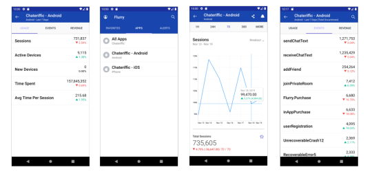
Sample UI from Old Version of Flurry’s Mobile App
Now that we’ve illustrated some of the issues we encountered, in Part 2, we’ll discuss moving to the new architecture and some of the things we learned along the way. Look for Part 2 tomorrow.