Regardless of a company’s earlier success, thriving in the new mobile app economy depends on engagement and retention. After acquiring users, the real battle to keep and ultimately monetize consumers begins. In the brave new world of “mobile first,” engagement is the new battleground.
This research is a redux to one of Flurry’s most popular reports, entitled Mobile Apps: Money, Models and Loyalty. Released three years ago, the initial report organized app category usage into a loyalty matrix. We do the same again now, while also acknowledging that a lot has changed in the app economy since then. To start, there is an order of magnitude more available apps in the App Store, now brimming with over 700,000 app choices for consumers. We are three generations beyond the then-new iPhone 3GS. We have since met the iPad, and perhaps tomorrow will meet the iPad Mini.
Combined, smart devices – iOS and Android smartphones and tablets – are the fastest adopted technology in history; adopted faster than electricity, televisions, microwaves, personal computers, cell phones, the Internet, dishwashers, stoves, and a whole lot more. Last month, Mark Zuckerberg, CEO of Facebook – the number two most visited website on the web – declared “we are now a mobile company” explaining that “you just could do so much better by doing native [application] work” versus using languages like HTML5 on top of browsers. Each month, approximately 600 million of Facebook’s 1 billion monthly active users already accesses Facebook via mobile.
Each app category has different user engagement and loyalty characteristics. Understanding a given app audience based on the category to which it belongs can inform a company’s app acquisition, retention and monetization strategies. For this analysis, we use a sample of apps used more than 1.7 billion times each week. In total, more than 80,000 companies use Flurry Analytics across more than 230,000 apps to understand consumer behavior and improve their apps.
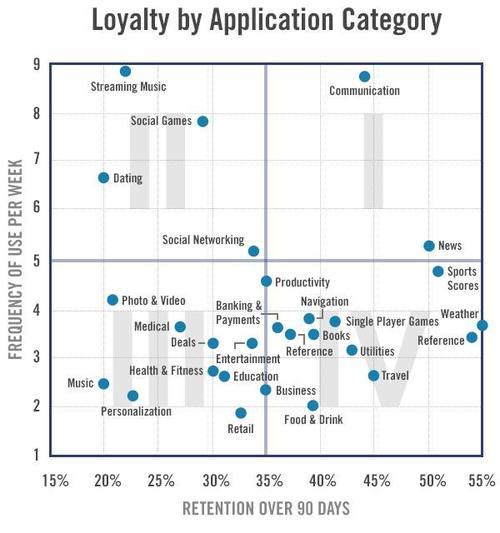
The above matrix plots application categories by how often they’re used compared to how long consumers continue to use them over time. Specifically, we plot the 90-day retention rate of app categories on the x-axis against the frequency of use per week on the y-axis. We lay the “scatterplot” out in a Cartesian coordinate system with four quadrants. For our categories, we started by taking the application categories defined by Apple in the App Store. In cases where a cluster of applications within a parent category showed meaningful usage differences, we created a sub-category. For example, Flurry divides games into Social Games and Single Player Gamesgiven how differently consumers use these sub-categories.
Quadrant I includes apps that are used intensively and to which consumers are loyal over time. News and Communication apps are the two categories that appear in this category. On average, because these apps tend to have stable, growing audiences, they are best positioned to generate advertising revenue or charge a subscription. Consumers perceive these apps to deliver enduring value over time.
Quadrant II is comprised of apps that are used intensively, but for finite periods of time. They are perceived by consumers to deliver value in bursts. Streaming Music, Dating and Social Games best typify this quadrant. Consider for a moment why Dating is a category that appears in this quadrant. For most people, we can assume that finding a long-term “significant other” is the ultimate goal of dating. As a result, the app maker should expect customer churn. While usage may be high during the time when a consumer looks for a suitable partner, once that person is found, usage stops. An implication could be that to maintain a growing audience, apps in this category require heavy, constant acquisition to find consumers who are “in the market” for dating. Ironically, the better the app is at match making, the more churn it should expect.
Quadrant III contains apps that are used infrequently and have high churn. They contain the most “one-and-dones.” Personalization is an example that makes sense for this quadrant, since a consumer uses this app to change her screen saver or select a theme for her operating system. Once this set-up is complete, it’s unlikely that the user will need to re-use this application. Since the app’s value is diminished almost immediately, applications with this kind of usage pattern are best served with premium pricing models; that is, charging the consumer before providing access to the content.
Quadrant IV is made up of apps that are used infrequently but deliver very high value when used. Even though they’re used only occasionally, these apps can remain on a consumer’s handset almost indefinitely. For example, consider how useful an airline, hotel or rental car-booking app is to a business traveler. While the app remains unused between business trips, its value spikes as soon as the next business trip needs to be scheduled.
The quadrant an app falls into can help the content creator decide what business model is best. On average, Quadrants I and IV (the right-hand side) are better suited to subscription and advertising-supported models. The main reason is that these apps have perceived enduring value by consumers over a long period of time, and therefore more successfully retain their user bases. For ad-supported apps, high repeat usage translates into more ad impressions served. Categories on the left-hand side, Quadrants II and III, are better suited for one-time download fees. Additionally, quadrants II and IV (top left and bottom right) are likely best for in-app purchase models. For Quadrant II, the intense usage means that consumers find very high value during a short window. This creates the opportunity to offer new content or functionality during “binge” usage. Adroit social game makers are masters at driving in-app purchases during a consumer’s greatest moment of engagement. For Quadrant IV, because the user will return again and again, there also exists the possibility to find new ways of increasing value, which includes offering add-on functionality or content for a fee.
For more data, the table below provides 30, 60 and 90-day retention rates as well as weekly frequency of use numbers. Note that some of the categories included in the table below are not included in the matrix chart above.
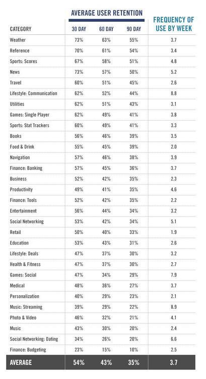
Compared to Flurry’s 2009 analysis, 90-day retention rates have increased from 25% to 35%. Additionally, frequency of use has decreased from 6.7 in 2009 to an average of 3.7 now. We attribute increased retention rates to increased quality in the market, driven by more competition. With tens of thousands of more companies building apps and hundreds of thousands of more available apps, the quality of apps has risen dramatically. Simply put, app makers are getting better at holding a consumer’s attention longer. Additionally, we believe usage rates are lower because consumers have more choice than ever and are splitting their time across more applications. While Flurry included 19 categories in its 2009 report, we now include 30 distinct categories as the industry has matured and more distinct verticals have appeared.
With more than a billion smartphones and tablets now in use, as well as the eventual move of apps into the living room through connected TV efforts by the likes of Apple and Google, digital distribution is changing the way the world does business. No matter what category your app belongs to, understanding and improving user engagement is the new currency of doing business in the new digital world.